Tuesday, August 31, 2010

Check this out:


Check out the rubons here!


Free Range is still available.  Free range?  That's a really pretty add-on and has some yummy new product from Cosmo Cricket, among others (JBS butteflies and delicious butter yello buttons).  And lets not forget the stamp!  Check them out here.

Monday, August 30, 2010

Crate Love - Mermaid Horse

I'm busy playing with all the delicious new Crate Paper, so I thought I'd share a layout.  This is Restoration, and Payton on the Mermaid horse at the Carousel by the Sea in Seaside Oregon.  While camping at the beach, we took a couple of day trips, and one of them was up North to Seaside.

Payton is a bit obsessed with two things:  horses, and carousels.  So when she saw this "mermaid horse" as she called it, she couldn't see anything else.  This was THE animal to ride.  Lucky for US she managed to snag her choice.  We may or may not have held her back in line just to ensure she got it a time a or two as well, lol.


For perspective, I trimmed the medium/large doilies with my 3 inch circle punch.  I also tried, I really did, but I had to do it again and put the title on the circle.  I can't help myself!  (I also glued those alphas DOWN as soon as I saw this photo up close, lol.  They aren't going anywhere).

My advice to titles on a curve....  have some sort of line to follow.  In this case, there's my yellow doilie.  The second piece of advice is to put each letter perpendicular to that "line".  It makes the title look less messy and more structured, and makes this "line" look more apparent.

You can actually draw a line and later erase it.  I didn't need to in this case.


I hand stitched a couple of circles as part of my design as well.  I just wanted the extra texture.

Supplies:
Crate Paper Restoration
Refinish pattern
Doilies pattern
Flea Market pattern
Border stickers
Chipboard accents

Sassafras' Apple glitter alpha was a nice pink compliment
Kaiser Scrapbooking pearls were a nice accent too.

Thanks for taking a peek!  Davinie

Inspiration challenge

Hi!  Just wanted to pass along that I'm cohosting the Studio Calico blog this week and chose to do an inspiration challenge based off the following collage:


(from the Creature Comforts blog, post and photo credits here).

Check out the challenge post here.

Have a great day!  It's raining outside right now and I hear that we got SNOW on Mt Bachelor, which is @30 miles away.  Wha????  Isn't it still August?

I'm also twiddling my thumbs for school to start.  Morgan is the 7th, and her teacher is "New Teacher, name to be announced".  okayyyyyy.   Payton starts the following Monday.  It can't come soon enough!

Davinie

Friday, August 27, 2010

Back 40 - Studio Calico's September kit. YUM.


It's live!  Get your kits and add-ons now!

Me, I picked up Fresh Cut and Free Range.  I also picked up the In Stitches and Postage edge punches this month, and cherry mist. 

Check out the new punches from EK Success!  That great big apron lace and the swiss cheese punch look fun!

On to my layouts:


We were asked to create a layout inspired by Maggie's cover layout for CK this month.  I thought it was one of the most artsy and abstract covers I'd ever seen with CK, so I was excited to play along.  I ended up going with the use of mist, as well as random paper placement.  I had a lot of fun with this layout. 

Next up was a two pager using only 4x6 photos.  You'd think I'd create a layout with beach photos from our recent trip, but even more recent was a trip to Couer D'Alene, so I immediately worked with some fun photos I snapped at the lake.  It was also overcast an my photos had a lot of gray in them, which matched the kit better.


Instead of using my boundary waters punch, I decided to go with the postage edge punch as a form of "choppy waters".  It works, yes?

The green scallop was used to balance the placement of the title on a curve.  I don't know why, but I'm a bit obsessed with making my titles this way lately.  So far I did it with two layouts this month.


For this one, I used a fun camp pic of all the kids.  These faces crack me up!  I was out of E's, but a 6 worked perfectly in it's place, what with 6 kiddos, and all.


I used brown mist on that chipboard piece and used my upper crest punch, which is a little smaller than the bracket punch currently in the shop. 


Joy was my favorite layout this month (and I thought of my sweet friend Joy when I was making it too).  I used my cherry mist here.  I stamped using walnut ink, a great dark ink to use for stamping or distressing. 


Last up was a card with Cosmo's Togetherness line, my favorite of their new release.  Love that JBS button too. 

I just realized I never received the Cosmo Cricket chipboard elements from the shop.  I need to get some and add it to my next box!  :)


If you have any questions let me know!   I will be sharing the design process in creating one of my layouts later this weekend.

Davinie

P.S.  I would love to know what size my photos need to be to share them in blogger under the new picture format where I could post them at the large size without being pixelated.  I cannot for the life of me figure it out.  I have two different computers with different monitors and it looks different on each one.   Please and thank you.  :)

I hope you get what you want!


Fresh Cut is going to go fast because of that stamp set that matches the Classic and Royal butterfly punches, just like in this sneak:

(Actually, the punch used here is the 3 -in -1 from Martha, but the Classic and Royal butterflies fit the stamp).


Good luck!  And don't forget to check back tonight at 12AM EST  (9 PM my time) for more chances and the DT reveal!

( I got Fresh Cut and Free Range this month).

:)

Thursday, August 26, 2010

Back 40 sneakage

I'm slowly working my way down the to do list, and next up are sneaks.  I suppose I should probably get them posted before reveal, yes?

I had a lot of photos with many themes this month, so had fun going through them to choose photos to use for this kit. 

This kit was very moody to me.  I had gray's to choose from, as well as bright happy colors.  It was a moody month, so it all came together perfectly.


The In Stitches border was used on this layout.  That Indie Girl strip of paper needed just a little something and this punch was perfect.  I also used my upper crest punch, because I don't have a zig zag punch (yet) and needed the point to match another element in my layout.  The bracket border punch in the shop is a lot bigger than this punch. 

Call me crazy but I have this thing about my decorative borders matching something else I am using.  I used a pinked circle in this layout and needed a point somewhere to match it.


I just about grabbed my boundary waters punch for the above layout, but I just went to the beach a few weeks ago and have plenty of layouts planned for it.  I thought using my postage edge stamp (back in stock on the shop!) would be a fun alternative, also representative of choppy water, and matched my double embossed lace border punch well.  Lots of strips on this one.


That chipboard frame from Cosmo will be in the shop this month......


I had a LOT of fun with that layout.  I'm also in love with mist, if only for the sole reason it sure makes changing the color of chipboard super easy.  This is cherry mist in action. 


There's that In Stitches punch again.  LOVE how fun it is!  I played with turquoise floss there.  You can also see a nibble of the butterfly stamp set that will be in an add-on this month, my favorite scallop punch, and the Martha Stewart butterfly punch set. 

And yes...  that's mist!  Splattered cream mist.  You can also see a nibble of hydrangea on this one.

Purple thread too!

Reveal is tomorrow!  See you there!

Monday, August 23, 2010

FINALLY. home.

Oh, I have tales to tell!  We had a wonderful time at Silverwood and the beautiful city of Cour D'Alene Idaho, but it is so nice to be home.
I have so much to do!  I haven't done a thing to prepare my kids for school, and Morgan will be in first grade!  We have gym shoes to buy and a lunch box to choose!

I have a lot of photos and stories to share, but for now, I'll leave you a glimpse of the theme park.  We really did have a blast.


Have a great day!  Davinie

Wednesday, August 18, 2010

On the Road again.......

Check it out:


That would be me, in the front seat, on Splash Mountain at Disneyland.  January 2009.

When I headed to California for CHAW, my hubby and I decided to do double duty and bring the family so we could also do Disneyland in between working the floor at the show. 

I love Disneyland.

I'm not a huge fan of big rides though.  I'd just prefer my belly to stay encased within my ribs, and not in my throat, my toes, or left behind me at the starting gate at California Screamin'. 

That's just me.

With Splash Mountain, though, I didn't think it'd be scary, so I decided to go on it in an effort to show Morgan it'd be just fine and she should do it too.  At the time she had just turned 5, and Payton was just short of three (and therefore...  FREE). 

I was focused on Morgan and yippity yappin' the whole time we were in line, so it wasn't until that moment when we exit the building and do what appears to make a 90 degree dive to the ground that I realized how stinkin' silly it was to sit in the FRONT. 

Truth be told I wasn't too scared.  It's just that it was January, not super warm, and it looked to me like I was going to get very very wet!

And I did, a fair amount.  Keep that in mind if you go!

We got our souvenir photo afterwards and my first thought was, "phew, at least I don't look as dorky as that chick behind me."

But that chick just so happens to be my sister.  Her name is Alyca. 

And my relief was only short-lived, because right after I made that declaration she clued me in.

She's a faker.

That was a fake reaction.

There are people in this world who focus on the signs that tell you where the cameras are going to be when you go on roller coasters, just so that they can act dorky for the camera.

whatever.

Suffice it to say I'm not a huge fan of roller coasters, and probably won't be pitching $14.99 towards any fake souvenir photos anytime soon.  heeeee.

Another thing I'm not a fan of?  Wearing a swimsuit in public, surrounded by what'll feel like a zillion people.  I'm not a fan. 

It's a wonder, then, that while you are reading this, I'm actually making the long trek here:


I hadn't even heard of this place until last year when some friends went, but since then it has become the chosen location of a family gathering with Steve's family.  His sister's kids are tweenish (some older, some younger), and they are skipping part of their first week of school in order to go.  We had very busy summers and this was the only time that worked. 

Ayiyiyiyiyiyi.

Wish me luck.  I do anticipate having a lot of fun.  There's a kiddy park.  And we aren't going to be at the theme park the whole time.  We are renting a house in Couer D'Alene and plan on checking out the area while we are there too. 

I'll be back on Sunday night!

Davinie

Tuesday, August 17, 2010

My July - and a shoutout to Bella Blvd

Link your layouts to this post if you want to play along this month.  You'll also see the link to SCT and the appropriate blog post for the Scrapbook and Cards Today blog.

July.  Oh July.  I loved the sketch for July this month and had a lot of fun going through my photos.  Check out what I chose:

(click it to enlarge the photo).

Now let's talk design.  I adjusted some of the sizes per the photos I wanted to use.  I only had horizontal photos of Steve, so he had to be in the middle there, and I didn't want all the lake photos to be together, so I switched places with the photos at the top, because I really wanted MY mug to get in the layout this month (I'm going to do better about making that happen every month, in fact).

When I had them all printed out and lined up, my first thought was that I needed to redo them, because the photos seemed too big to me, and that they'd take up all the space, not leaving much room for the embellishments. 

And then I told myself I was a complete moron and to leave them alone.  The point of a scrapbook layout is SUPPOSED to be the photos, not the embellishments!  Especially for this particular challenge, for pete's sake!  You can focus on pretty paper in another layout!  I agreed, and I told myself to chill out.

For the title I used the usual, my month stamps from Studio Calico.  Those butterflies?  Those are a little sneak peek at a stamp set in one of the add-ons for the September kit from Studio Calico.  I'm a bit in love with them and this particular shape works beautifully with the classic butterfly punch from Martha Stewart.  There are a couple different designs in this set with this shape, and they are also a few designs for the royal butterfly shape.   Lovely, huh? 


Those tags?  Those tags are 7gypsies.  I checked the label and I have had them since 2003.  These tags are neverending and I love that I am utilizing my stash, still.

Those flowers are Dear Lizzy crochet blossoms.  They worked perfectly with the paper.

The paper?  That's the Hello Beautiful line that debuted at the summer CHA show from Bella Blvd.  The team from Scrapbook and Cards Today will be hosting the Bella Blvd blog in the coming weeks and I was sent oodles of new product to play with.  The Hello Beautiful line is my favorite and the color palette was perfect for this July layout.  I loved that red print but used part of the paper for one of my blog layouts, so mixed it with another red print for the left side of my layout here.

The design thought for that idea is this:  the left side of my layout is heavy because of all the large photos.  For that reason, I needed to balance the right side of the layout, so carried the darker, heavier print to the right.  Then on the far left side, I used the print that had more color in it.  This balanced out the page more.  There's also balance in mind with the placement of the flowers and butterflies on this layout.  The far left one is in the middle, it carries you through the photos and up to the title and larger flower, which is there to bring weight to the right, and then the last bloom is on the lowest point of the layout, on the right hand side, to carry your eye through the rest of the page.

Make sense?  I just love that Becky keeps that type of thing in mind.  I think that's why people gravitate to her sketches without thinking about it.  Balance.  She has it.

With days to spare I am finished!  You still have time to play along!  The deadline is the 20th if you want a chance at a prize.  The prize this month is adhesive from American Crafts!

Davinie

Sunday, August 15, 2010

Isn't it a breath of fresh air?

I still have a few tweaks to make, but I'm ready to move right on in my blog.  I should have had a hammock set up in front of that barn there, just for me.  :)

My friend Jenn helped me.

The digital products came from here:

http://www.designerdigitals.com/  (specifically anna aspens for the stitching)

http://www.digitaldesignessentials.com/

She's not ready to yet, but there may be a time when she'd be willing to revamp other blogs, so send her an email if you want to get on a list for that. 

Be back soon!

Thursday, August 12, 2010

Crate Love - Snow Days

I wanted to share one of Crate Paper's New lines, Snow Day, and my layout for the CHA booth.


It turns out, the color palette in this line is perfect for me, because my girls wear a lot of purple and blue in their winter wear, along with the pink.  It was really fun to work with.


I added a little bluster to this particular day by hand stitching some "wind" on the snow.  The white scallop is actually scalloped Bazzill, but I hand cut the scallops from two sides so I could cut it down from a 12x12 and make it fit my layout.


I loved the chipboard circles and the layered snowflakes, so I made dimensional pieces with circle punches and ink to create faux snow falling.  I love the texture that it added.

You can see all the products available for this line here.

Have a great day!  Davinie

Tuesday, August 10, 2010

crafTuesday - Geocache

With plans to camp at the beach for a week, I knew there might be an opportunity for craft projects.  I was looking for something inexpensive and fun to do outdoors when I decided it was a great time to try Geocaching.

Ever heard of it?

Geocaching is a high-tech treasure hunting game played throughout the world by adventure seekers equipped with GPS devices. The basic idea is to locate hidden containers, called geocaches, outdoors and then share your experiences online.

It's free and I've always wanted to do it.  There are hidden treasure everywhere.  You'd be surprised how close you might find one to where you live.

I registered at the Geocaching site and printed off a couple of cache's in the campground we were staying at as well as the nearby beach.

Going with the treasure hunting theme, I went to Michael's and picked up a bunch of $1 wooden boxes, treasure chests, for the kids to decorate.

I then loaded up on markers, some washable paint, some sequins, etc., and let the kids decorate their boxes.


Our week ended up really busy so we only had time for a cache or two. 

Geocaching.com has an Iphone app, which is great, but Marci doesn't have an Iphone and our campground has spotty service, so we were glad to have Steve and his Magellan GPS thingy.


You just enter the coordinates and start heading in the right direction.  We had a lot of fun searching for this one.  If you are getting lost there are hints and a decoder to help you find the cache, and we needed it this first time.

Eric was the lucky one to find this cache.


The kids had mixed feelings on that idea.


But they had a blast, I swear.

As long as you have access to a GPS system of sorts, you have an opportunity to search for treasure.  This particular cache didn't come with a prize but many of them do, so save those Happy Meal treasures or something else fun to leave behind.

Monday, August 09, 2010

Cathedral Quilt pattern on paper tutorial

I have had several requests for a tutorial on one of the layouts in my August gallery at Studio Calico this month.  In particular, for this layout:


I have LOVE loved this pattern ever since October Afternoon put it on a patterned paper at CHAW10.  It was my favorite print from the show.  But I didn't know what it was called.  I have googled "quilt pattern" many times, but the number of patterns that type of search comes up with will boggle your mind, so I figured that quilt was meant for another bed.


I just happened to stumble upon a tutorial she did for the Fiskars blog using the Cathedral Quilt pattern to make a picnic blanket.  At first I was elated because I had finally located that pattern which meant new bedding for the master bedroom!  But after looking at the pattern I also realized.....

I can totally make that with paper.

And I sounded just like my mother.  ack!

When I received my August kit I immediately knew what patterns I wanted to play with, and quickly went to work.  This layout looks involved and difficult, but these quilt squares are really quite easy!  This is how it works:

1.  Trim circles from a patterned paper of your choice.  Something to note:  If you are using a two sided piece of paper, you will cut a lot of time and paper out of your project.  You just need to determine if you would like to see both sides, and which side you would like to be the window, and which side you would like to have as the frame.

If you are using a single sided pattern, as I did, that's fine.  Just choose prints that you like, and trim circles from the print that will frame the window (in reference to my layout, trim a circle from the pattern that will be the manilla print).

As for punches, I chose my 2 inch Marvy Circle punch so that I could have 6 across and have room on the outside edges, but odd numbers are usually more visually pleasing, so for this tutorial I chose to use my 3 inch circle punch.  I wish I had used this punch or the 2.5 inch initially so you could better see the pattern of the paper in the window, but at the time, I was winging it, and wasn't sure what to do, lol.

Edited:  I measured and I actually used a 2.5 punch on my Polliwog layout, not 2.  The squares inside are 1.5 inch squares.  I apologize for the oversite on that 1/2 inch and hope i didn't mess anyone up!  You can still use 2 inch squares!  :)


2.  After you have trimmed several circles, it is time to score them.  A 3 inch circle means a 2 inch square, and this is the long and drawn out way I did it.  I trimmed a square out of a piece of chipboard, and traced it on my circles, which for me seemed much faster than lining things up and measuring.  The outside corners of the square should meet an edge of the circle.  I traced it on the side of the paper that will be the window (ie, if that piece of paper in my Polliwog layout was double sided, I would be tracing on the side with the little creatures).  Keep in mind the orientation of the pattern on the paper, and make sure to trace the square so that the pattern has the correct orientation (the flowers are straight, stripes aren't crooked, etc).


If you have a ScorPal, yay!  If you have a scoring blade for your rotary cutter, yay!  If you have a ruler and a bone folder from Making Memories that you have had since 1997, you will do just fine!  I don't have a ScorPal, and couldn't find my scoring blade.  So it was a ruler and a bone folder for me.  And it worked just fine and dandy.

Score the line that you traced.  Folding the paper over takes away some of the width, and you want to try and match up corners on all four sides.  If they don't, don't worry about it!  I didn't!  I made more circles than I needed and sent the bad ones to the round file, or hid them under my photo.  Or I stitched on them.  Quilts are homespun, handmade, and imperfect, so I can't expect my scrapbook layouts to be any different.


3.  If you have a double sided patterned paper for this technique, skip this step.  But if you didn't, or you want to create different patterns in your windows, at this point you need to trim squares out of those prints.  Make them 2x2, if you used a 3 inch circle.


4.  Now we need to use that bone folder, if you didn't have it out already.  Simple fold over the little flaps to the front of the circle, and score them.  After scoring all four sides, it'll look like this:


Do this with all your circles.

5.  Once you are ready to put your layout together, line up your squares next to each other on your layout.  If you trimmed out squares, this would be the time to put them in their place on your layout.  You simply slip the square under the folds and push them down again.  After doing that you can add a glue dot, or a dab of glue under each flap, to adhere it. 


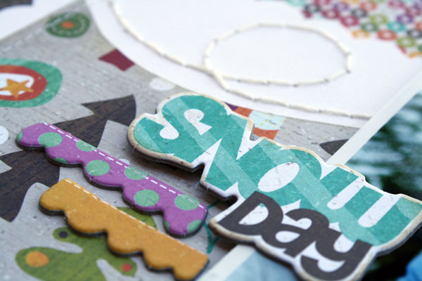
I stitched some of my squares down.  I didn't want the layout to look too complicated, so I only did it a wee bit, for effect. 


Voila!  The Cathedral Quilt pattern is now on a scrapbook layout, and it wasn't hard to make.  It's cushy though.  I like how the squares, all lined up, actually felt quilt-like.
And if you are interested in the quilt pattern, like I still am, here's Kendra's tutorial:

Have a great day!  Let me know if you have any questions about this technique and I'll try and answer them in the comment section.

P.S.  If you use this pattern on a scrapbook layout, please be sure to give proper credit.  Thanks!
Davinie